



TL;DR
- Context. Yummy's inventory tools were scattered: a scheduler on its own site, review screens inside a modified Odoo, waste in Airtable. Every new tool pulled the same data from the ERP all over again.
- Goal. "Access all inventory apps through one platform" and "act as the second layer between crew and ERP."
- What I designed. The portal's structure and navigation, an access model written so supervisors can understand it, and a design system of shared patterns (document list, document detail, configuration, product picker, scheduled change, status, feedback). This let Receiving, Stock Take, Stock Waste and the configuration pages ship as one product.
- Outcome. 9 surfaces (3 admin modules, 3 configuration pages, 3 mobile apps) shipped on one login and one component library. Inventory work went from 3 places to log in to 1, and new modules reached dev handoff in about half the time.
The system behind the screens
Stock Management is middleware. Once a day (00:00) it copies everything the apps need from Odoo Core into its own master data: warehouses, products, cost, brands, units, product categories, stock locations, product types and starting stock. Apps read from there instead of calling the ERP many times a day.
| Layer | What's in it |
|---|---|
| Master data (synced daily at 00:00) | Warehouses, products, cost, brands, units, product categories, stock locations, product types, starting stock |
| Admin portal | Receiving · Stock Take · Stock Waste · Backflush · Preparation · AutoWaste |
| Configuration | Stock Take scheduler · Stock Waste app · Return waste · Shelf life |
| Mobile apps (Lark) | Receiving · Stock Take · Stock Waste |
Order of data sent to the ERP: ① Backflush (sales × recipe = consumption) → ② Stock Waste → ③ Receiving → ④ AutoWaste → ⑤ Stock Take. The stock take runs last because it corrects whatever remains once everything else is recorded.
Entry and navigation
- One login with email and password. Errors are specific: "Format email salah" ("invalid email format") vs "Informasi yang dimasukkan salah" ("the details you entered are wrong")
- After login, a module launcher shows only the modules your access allows
- Modules are grouped by what you're doing:
- Admin Portal = what happened (documents to review): Receiving, Stock Take, Stock Waste, Backflush, Preparation, AutoWaste
- Configuration = what should happen (rules): Stock Take scheduler, Stock Waste app, Return waste, Shelf life
- Profile menu → registered name + KELUAR (log out)
Decision: the same supervisor switches between reviewing what happened and setting rules for tomorrow several times a day. Grouping by task instead of by module (Stock Take → documents / scheduler) makes it obvious which mode you're in.
Access you can read
Permissions are set per module, in words supervisors already use:
| Module | Roles |
|---|---|
| Stock Take · Admin Portal | Admin (view, export) · Supervisor (edit) · Validator (validate) |
| Stock Take · Scheduler | Admin (view, export) · Supervisor (configure) |
| Stock Waste · Admin Portal | View · Reporting (export) |
| Stock Waste · Configuration | View · Reporting · Product Supervisor (edit products) · Unit Supervisor (edit unit limits) |
| Shelf life | View · Export · Add & edit |
| Mobile apps | User + assigned outlet: view, start, count, submit |
Access decisions that are really UX decisions:
- No account without an outlet. Turning on Stock Take mobile access opens an outlet picker, and Save only appears once an outlet is chosen, so nobody gets an account that opens an empty app.
- Time-limited access as a user setting. Restricted (validate until 12:00) vs Not restricted lives in user management, not in code, so Ops can change who's allowed without a release.
- Mobile access moved out of Odoo Outlet and into the portal, so one access table now controls everything.
The design system
Foundations
| Layer | What's in it |
|---|---|
| Colour | Brand primary, neutrals, and 4 status colours that always mean the same thing |
| Type | 1 typeface with a 6-step scale tuned for dense tables and forms |
| Spacing | 4 px base grid, 8 px rhythm |
| Components | 48 components and 120+ variants: tables, filters, chips, modals, tree checklist, toasts, mobile shell |
| Docs | Usage notes on every component, plus a page of copy patterns for feedback and empty states |
I rebuilt the Stock Management design system (and Smart Admin's) around patterns that repeat across modules, so the outsourced engineers could build a new module out of parts they had already built.
Pattern library
| Pattern | Anatomy | Used in |
|---|---|---|
| Document list | Table · search · filter (date, outlet, status or category) · sort by date, newest first · export after filtering · standard empty state | Receiving, Stock Take, Stock Waste, Return docs |
| Document detail | Meta header (who, when, validated by) · product table · thumbnail → gallery · Edit ↔ Simpan inline editing · validate with confirmation · audit line | All three modules |
| Config list | Name · total products · last edited · user · action | Waste config, scheduler, return config, shelf life |
| Product picker | Tree checklist (location → brand → category → product) · checking a parent selects its children · filter-mode dropdown that reorders the tree · import from template / export | Scheduler, waste config |
| Scheduled change | Update sekarang (update now) vs Jadwalkan update (schedule) · tag Jadwal Mendatang DD/MM/YYYY · one pending change at a time | Scheduler (and later OLM) |
| Destructive mode | ⋯ → Hapus produk → checkboxes → Hapus confirmation | All configs |
| Status chip | Fixed meaning for each colour: grey = waiting, blue = validated, green = done in the ERP, red = failed | Stock Take, Receiving |
| Audit trail | Diedit oleh (edited by) / Divalidasi oleh (validated by) / Dikirim ke ERP oleh (sent to ERP by): name – date – time | Everywhere data changes |
| Feedback copy | Data berhasil diubah (saved) · Data berhasil divalidasi (validated) · Mohon tunggu sebentar (please wait) · Berhasil export data (exported) · Data tidak ditemukan… (no data found) | Everywhere |
| Mobile shell (Lark) | Outlet header · brand chips with status · collapsible category with counters · numeric keypad · sticky progress + submit · offline/online banners · blocking states | Stock Take, Stock Waste, Receiving |
Principles we used to settle debates
- Same job, same pattern. If two modules list documents, they use the same list.
- Show who did what. Every change records a name and a time, because in operations tools trust comes from accountability.
- Put destructive actions out of the way. Delete and bulk actions sit behind ⋯ and always ask for confirmation.
- Let the system choose units, locations and destinations. People enter what they saw, and the system works out where it goes.
Case in point: Receiving ("One Click Inbound")
Flow: every hour the portal pulls delivery orders (DO) from Odoo → the crew gets a Lark notification at 08:00 → crews validate in the app (with a photo) or supervisors validate in the portal → a bot (RPA) confirms the receipt in Odoo every 15 minutes. Statuses: unvalidated, validated, cancelled. Cancelling needs a reason, validating doesn't.
Iteration I designed (proposed, on hold when I left): get the reason from the action instead of asking for it
| Before | Proposed | |
|---|---|---|
| Quantity | Could only accept the DO quantity as it was | Edit the quantity per product in a "Qty Baru" (new quantity) popup |
| Rules | — | Can't go above the DO quantity or below 0. The field turns red with "lebih dari kuantitas awal" ("more than the original quantity") and Save is disabled |
| Display | — | DO quantity → edited quantity shown side by side |
| Remarks | Crews had to pick 1 of 4 remarks (more / fewer / different / no note) | Picker removed. Editing a quantity automatically tags the document "Produk yang datang tidak sesuai dengan dokumen" ("received products don't match the document") |
| Admin | — | A red dot on the document's detail button |
A picker asks people to describe something they've just done. The edit already is the description.
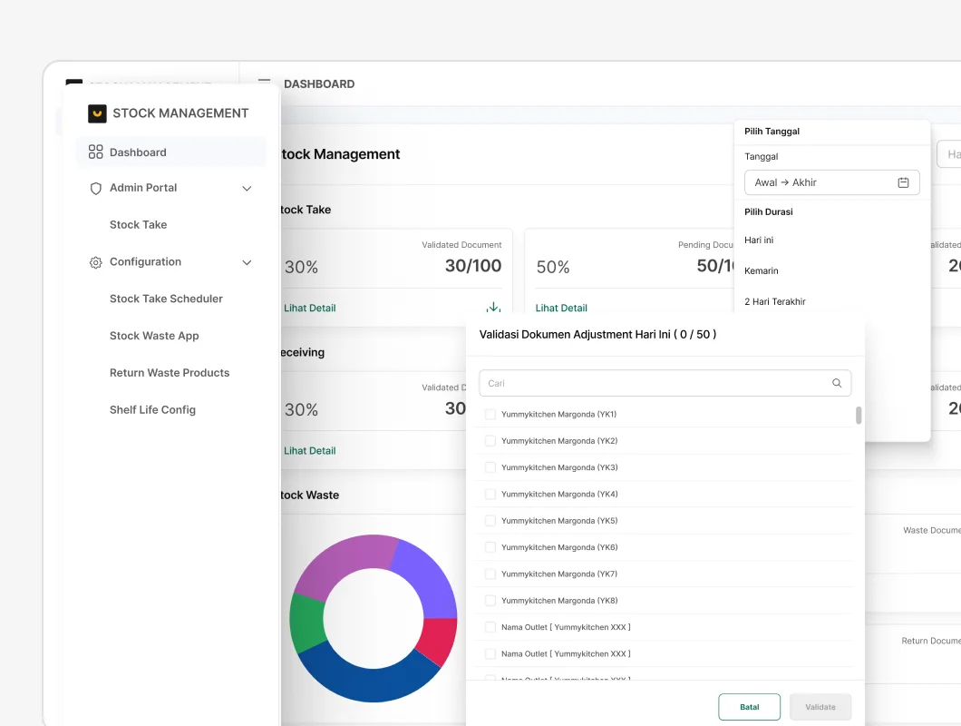
Dashboard (designed, on hold)
Stock take overview for today and the last 7 days: validated, pending and late documents out of all documents created. Clicking a card filters the list to those documents. [VISUAL if available]
Impact
| Metric | Before | After |
|---|---|---|
| Places to log in for inventory work | 3 (Odoo Outlet, scheduler site, Airtable) | 1 portal |
| Surfaces built on the system | — | 9 (3 admin, 3 config, 3 mobile) |
| Components in the library | built ad hoc per module | 48 components, 120+ variants |
| Brief to dev handoff for a new module | ~3 weeks | ~1.5 weeks |
| Data pulls from the ERP | many per app, every day | 1 scheduled sync a day (00:00) |
- Admin screens moved out of Odoo Outlet, which unblocked the ERP upgrade.
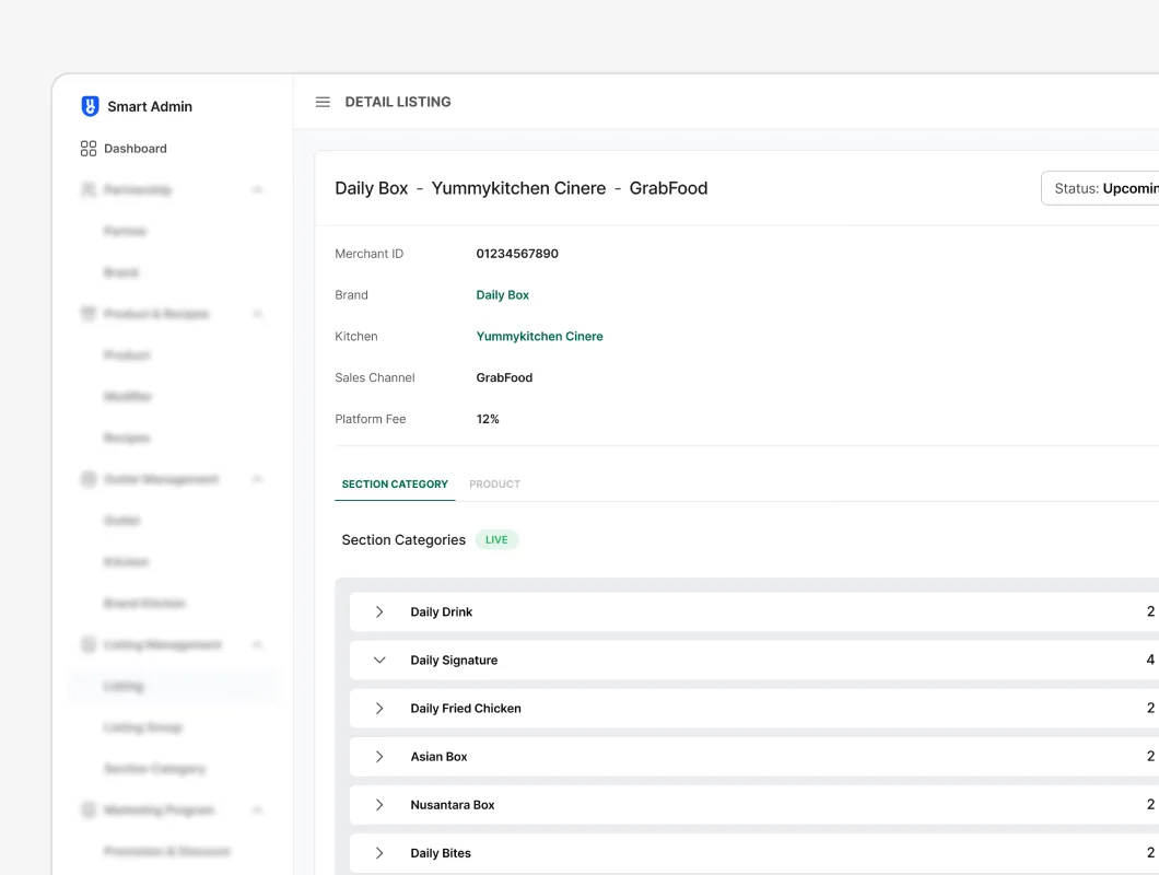
- The patterns carried over into Smart Admin: the "now or scheduled" change from the stock take scheduler shows up again in OLM's price and availability changes (see the OLM case study).
Reflection
- The real product is the data layer. Good screens on top of unreliable data would still be unreliable. Pushing for daily master-data sync and smallest-unit mapping mattered as much as any layout.
- A design system matters most to small teams. With one designer and an outsourced dev team, shared patterns were what kept six modules consistent.
- What I'd add: search across all documents in the portal, a notification centre for late and failed documents, and the dashboard built earlier, since supervisors start their day by asking "what's late?".
KhoirulAuthor
Thanks for reading — happy to walk you through the decisions on a call.