



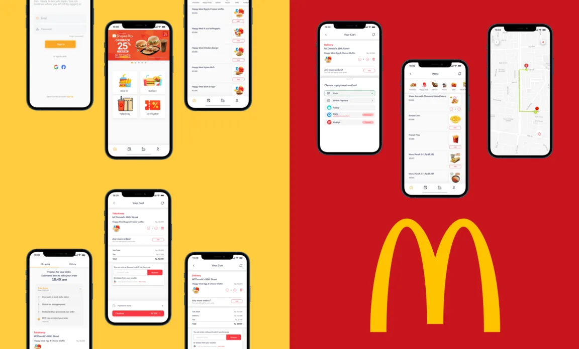
Overview
This case study looks at McDelivery, McDonald's own app for ordering food for delivery.
Problem statement
Hypothesis
During the pandemic, people increasingly ordered fast food through the restaurants' own apps. Reading McDelivery's Google Play Store reviews, I found many users criticising it — it was hard to change addresses, hard to track orders, and more. Trying the app myself, I agreed with them.
What my own test turned up:
- New users can't find the login form when they first open the app
- Users must save an address manually before they can see the menu
- Adding an item to the cart reloads the page
- Order tracking is inaccurate and hard to follow
- There's no way to leave a review
Objective
My goal was to uncover users' motivations and pain points — narrowing down to specific problems and finding their root causes. Based on the hypothesis above, I set out to improve the app's design and features. First, I needed to:
Objectives
- Find out why people use McDelivery
- Understand how users behave in the app
- Test the hypothesis and back it up with data
- Find users' pain points in the app
- Design a solution to the problem
- Validate the design solution
User & audience
People who have ordered McDonald's through the McDelivery app.
Roles & responsibilities
This is a personal project, so I owned the whole process end to end: research, UX design and UI design.
Stage 1 — Empathise
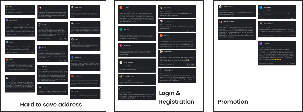
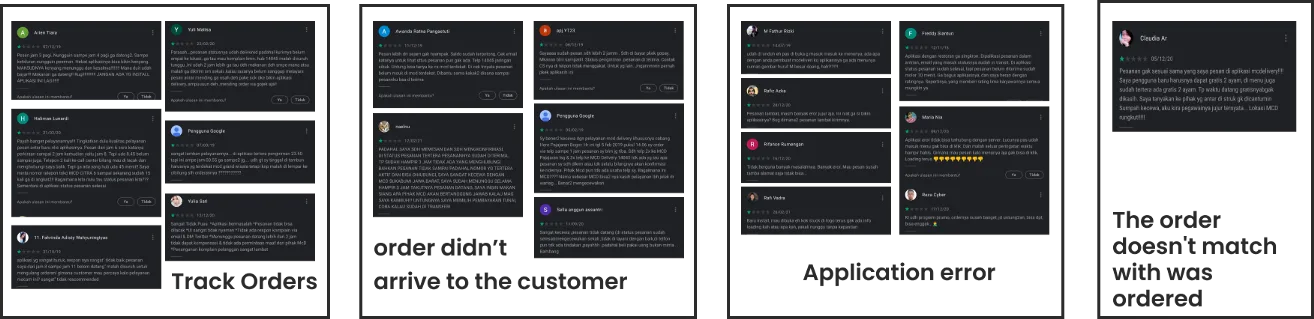
I started by collecting McDelivery's Google Play Store reviews to find users' pain points, then grouped the feedback into themes:
Usability testing
I gave three users the same task: “Order the same menu in the McDelivery app.” I wanted to observe how each of them moved through the ordering process, and how they felt and what they thought along the way.
Key findings
- Saving an address takes effort: users have to type it in manually before they can order
- Users must save an address before they can even see the menu
- New users struggle to find the login button, because the app doesn't take them to the login or registration form when they first open it
- Every time users add another item to the cart, they hit a loading page
- From the cart, users can't add more items without leaving the cart
User interviews
The Play Store reviews had already pointed to some pain points, so I dug deeper with in-depth interviews (IDI) with three people who had used McDelivery — one new user and two long-time users. Beforehand, I prepared a set of questions to uncover the real problems they face.
Interview questions
- Why do you use the McDelivery app?
- How has your experience with the app been?
- What frustrates you when using the app?
- What makes you choose the McDelivery app?
- What did you expect as a new user?
Stage 2 — Define
Problem domain
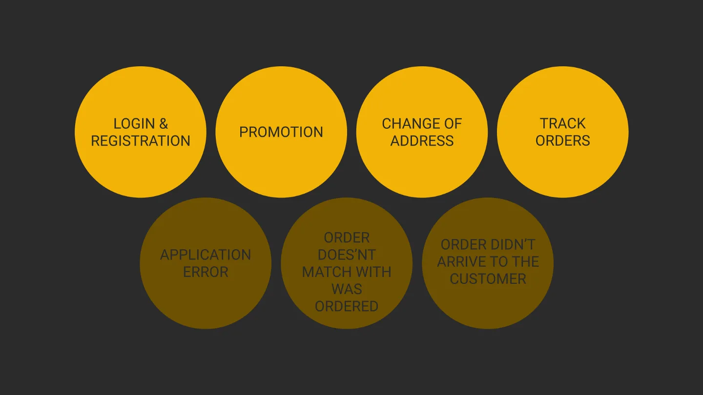
From the pain points in the reviews and interviews, I narrowed things down to four problems that users ran into most often.
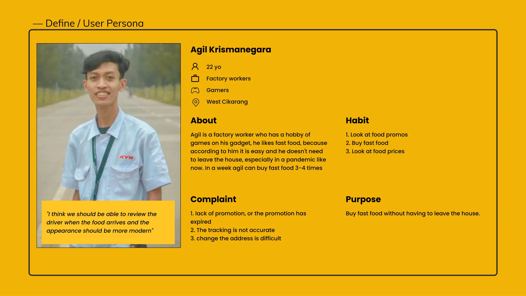
User persona
A persona describes a typical user: their demographics, behaviour, goals, pain points and frustrations. It helped me see the end-to-end experience from a wider angle.
Affinity mapping
After the usability tests and interviews, I listed every problem and complaint each user mentioned, then grouped similar problems with affinity mapping. Green notes are comparisons between users, blue notes are the problems users face, and purple notes are what users said.
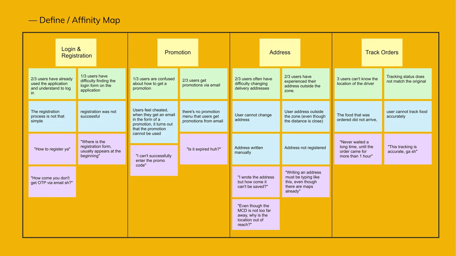
From these insights I wrote design mandates — ideas for solving the problems behind each insight. We don't have to solve everything; we can choose and prioritise what's feasible.
Insights
- Make order tracking easier
- Show promotions inside the app instead of by email
- Set the address from a map
- Make login and registration easier and more inviting
- Add onboarding
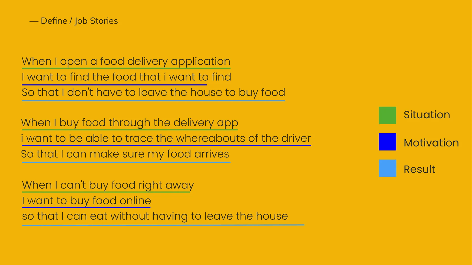
Job stories
I also used the job story framework to turn the interviews into job statements, to better understand users' motivations, situations and desired outcomes with McDelivery.
Defined problems
- Registration and login are confusing and not prioritised
- Saving an address takes too much effort
- Order tracking is unclear
- Promotions are often already expired
- The layout feels dated
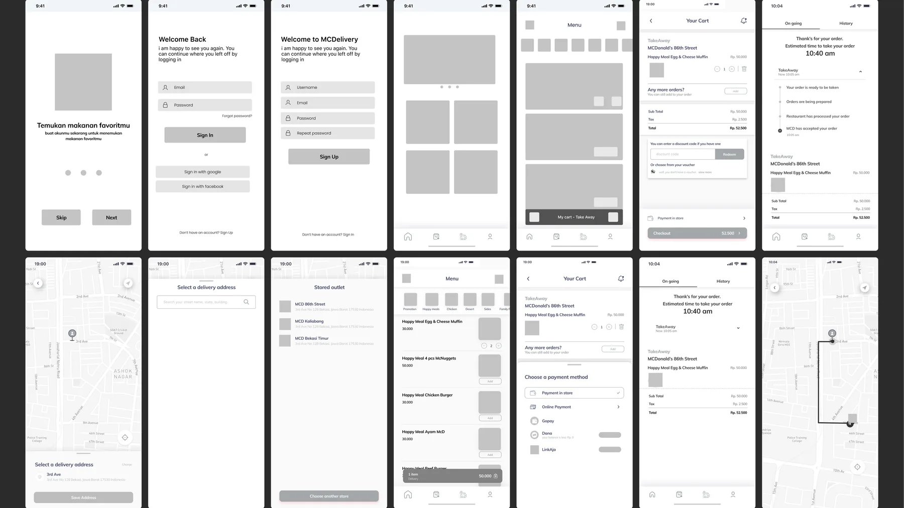
Stage 3 — Ideate
Wireframe
The design
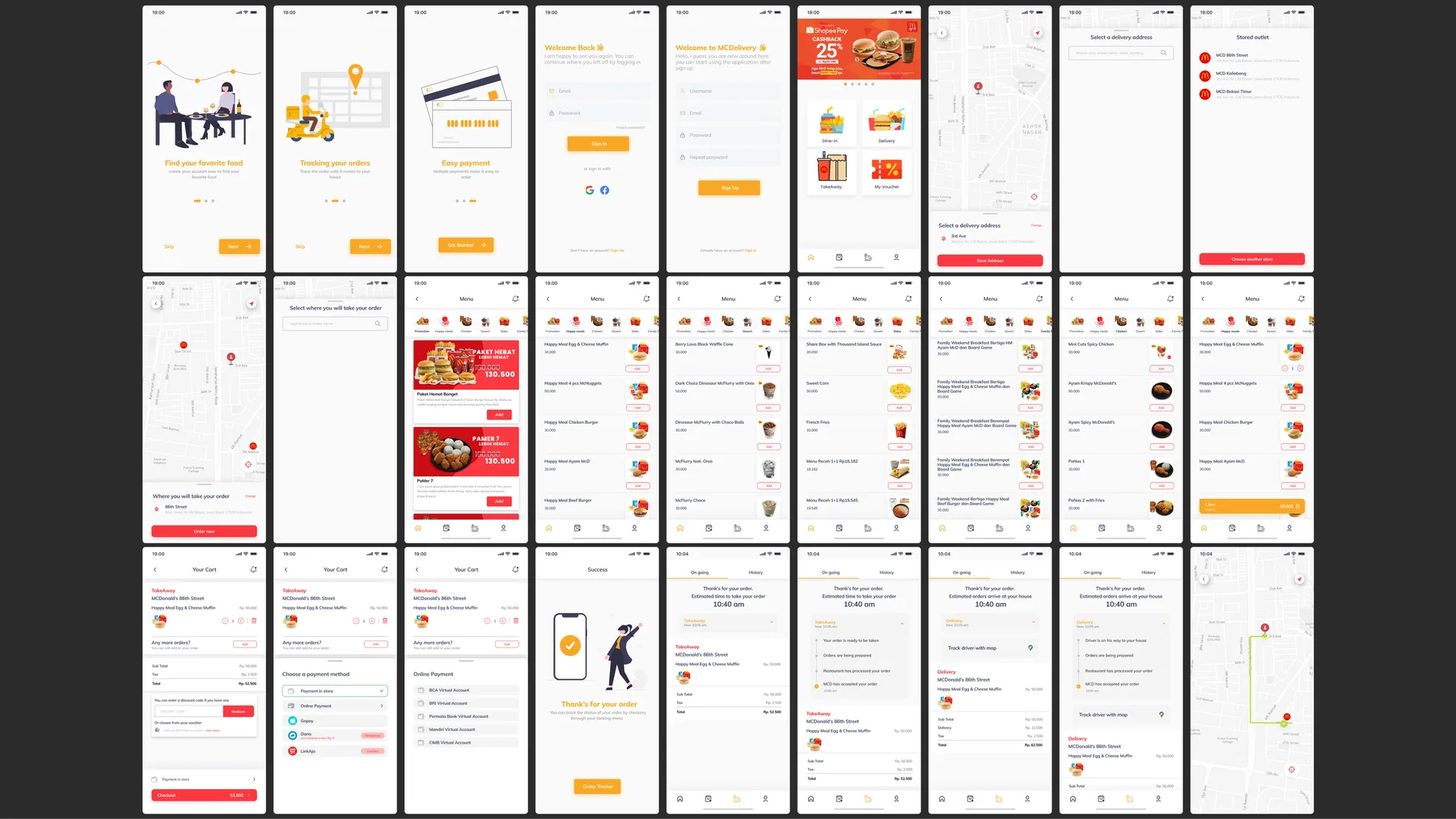
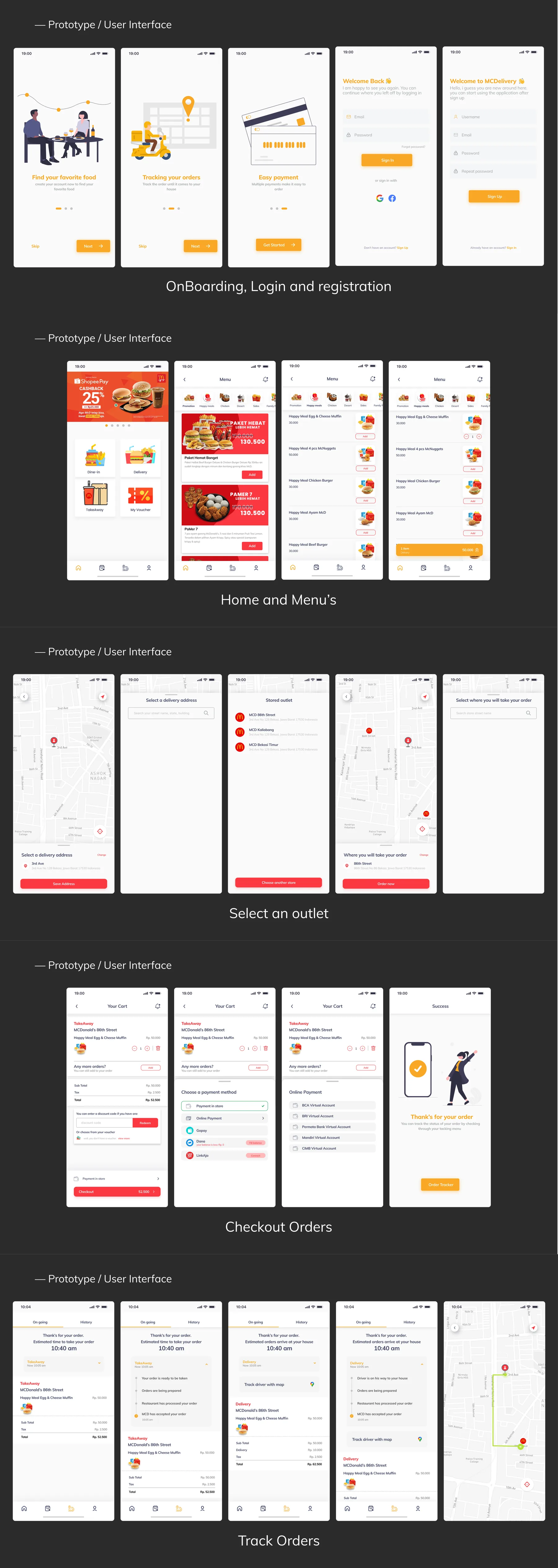
Stage 4 — Prototype
I prototyped in Figma, which makes it quick and easy — anyone with the share link can try the result.
Prototype and interactions:
Open the prototype in Figmafigma.com · interactive prototype↗Stage 5 — Test
Usability testing checks whether an app — usually still a prototype — actually works for people, which validates the ideas from the ideation phase. Success is measured by whether users can complete a given task without significant difficulty.
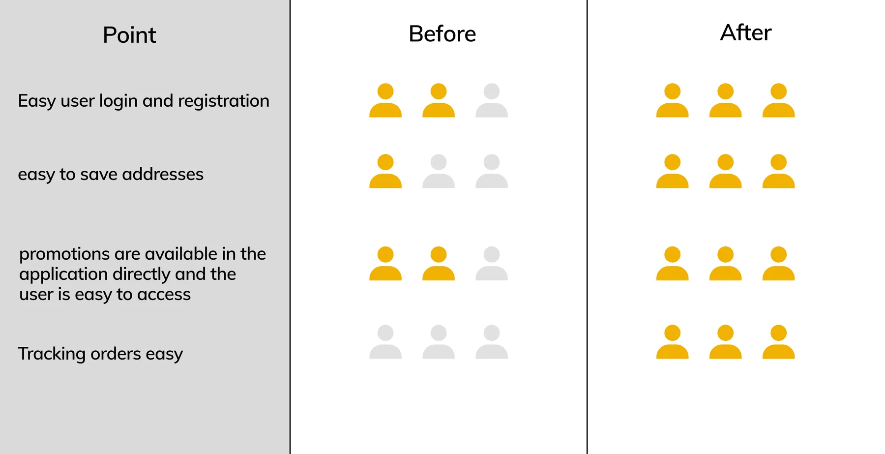
☻ Feedback from participants
“The app is easy and simple to use. The steps are clear and it doesn't take much time.”
“Saving an address is easy because it just uses the map.”
“My outlets are saved when I order takeaway.”
“The promotions are clear.”
The validation showed the new design makes ordering easier for users. There's still plenty I want to develop and improve in both UX and UI.
Thanks for reading — I hope this case study gives you some useful insight. To see more of my work, visit:
khoirulsyarifdribbble.com↗Khoirul Syarifudin - dibimbing.id - Cikarang Barat, West Java, Indonesia | LinkedInlinkedin.com↗
KhoirulAuthor
Thanks for reading — happy to walk you through the decisions on a call.