



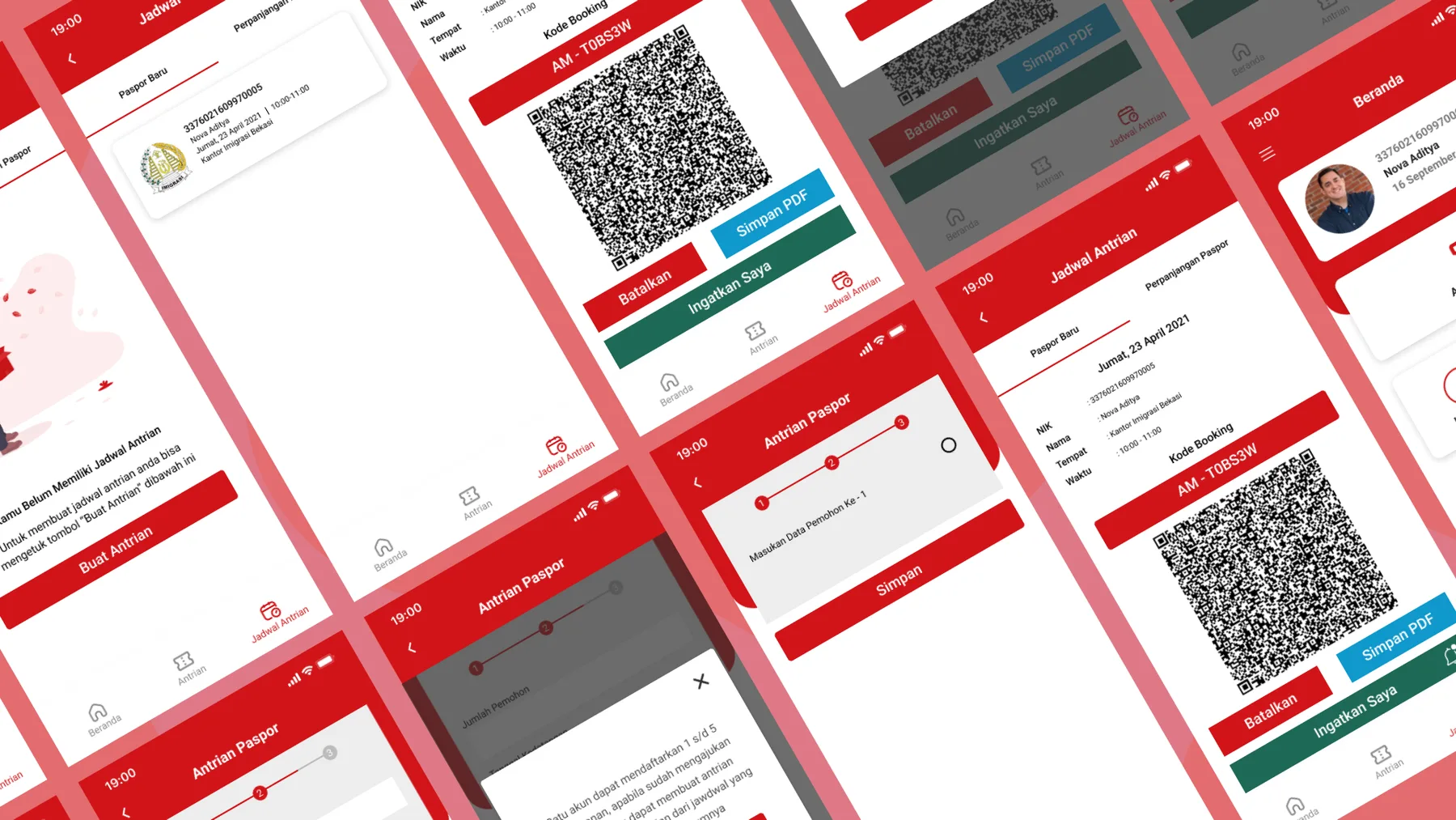
Problem statement
Hypothesis
With crowds banned almost everywhere during the pandemic, Layanan Paspor Online lets people book a passport queue without first visiting the immigration office. Public-service apps like this one often struggle to give clear, accurate information from government agencies. I ran a quick usability test to form this hypothesis — and the app itself is fairly simple to use.
What my own test turned up:
- The app suddenly force-closed.
- I couldn't find the nearest immigration office.
- There's no option to queue for a passport renewal.
- I didn't know which documents to bring to the immigration office.
- The available quota was small and confusing to read.
Objective
Based on that hypothesis, I set out to improve the app's UX, visual design and features. First, I needed to:
Objectives
- Understand why users apply for a passport
- Understand how users behave in the Layanan Paspor Online app
- Find users' pain points in the app
- Design a solution to the problem
- Validate the design solution
User & Audience
People who have used the Layanan Paspor Online app.
Roles & Responsibilities
This is a personal project, so I owned the whole process end to end: research, UX design and UI design.
Stage 1 — Empathise
Empathy means building a real understanding of the problem by learning about users' goals, motivations and pain points.
At this stage, I did three things:
- Planned the research
- Wrote the research guidelines
- Ran the research
This is where I pinned down exactly what problems Layanan Paspor Online users run into. There are several ways to do that — interviews, in-depth interviews (IDI) or surveys.
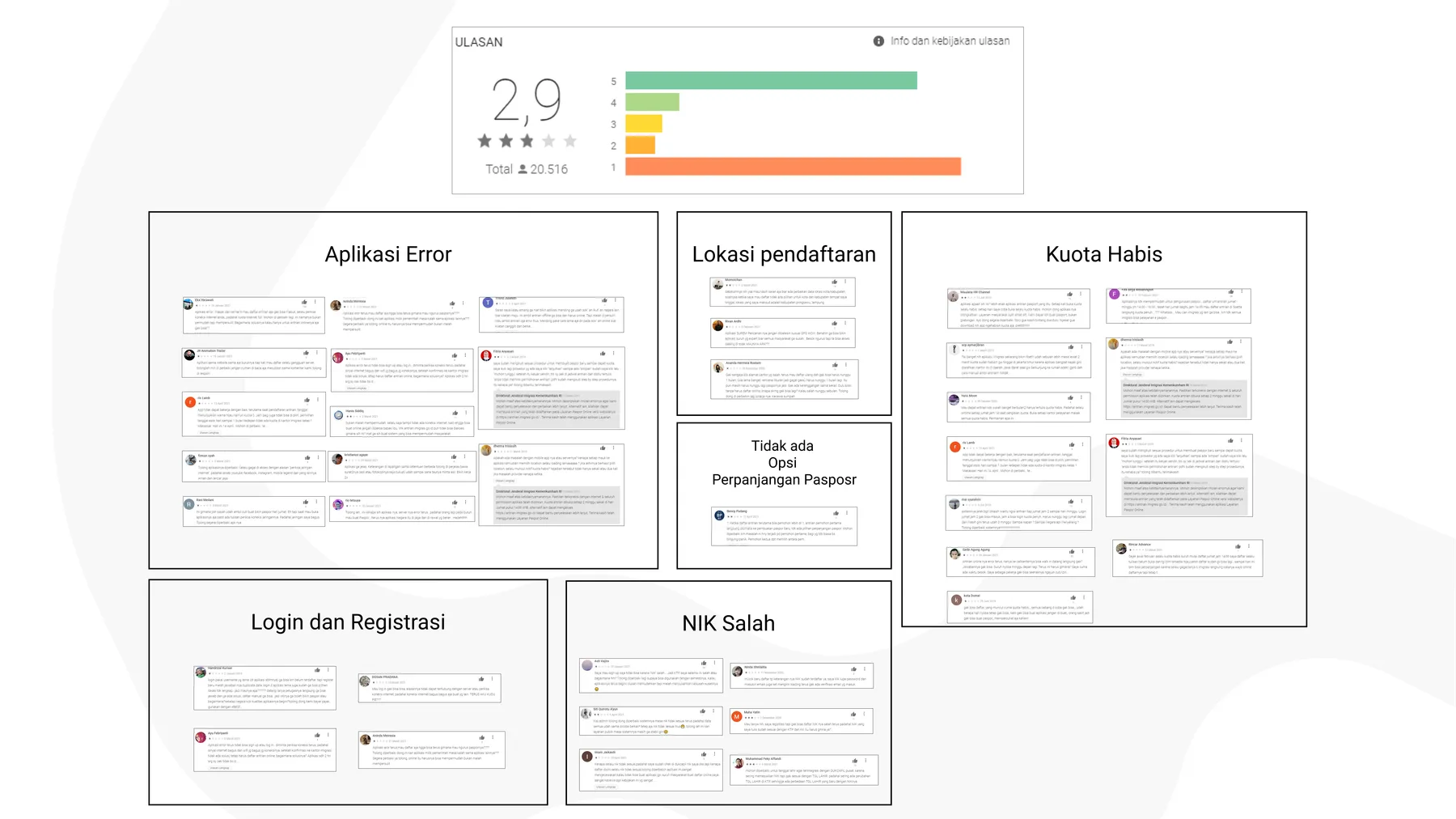
Since I didn't yet know what users struggled with, I started with Google Play Store reviews to collect ideas I could test later. Reviews alone weren't enough for ideation, so I added interviews with five respondents. Why five? The article below explains it.
User interviews
Why You Only Need to Test with 5 Usersnngroup.com↗Finding five respondents proved hard: I got four, and once their answers became nearly identical and they started to tire, I stopped at four. I also asked each of them to try the Layanan Paspor Online app again, to observe their behaviour and pain points first-hand. From these sessions I built the user personas, affinity map and customer journey map.
Interview questions
- Why do you need a passport?
- When you booked your queue, was there quota available?
- How did you feel while registering for the online queue?
- After registering successfully, what did you do next?
- Does this app help you? Why?
- When you scheduled your visit to the immigration office, did you already know which documents to bring?
- How did you find out?
- Did you have to fill in any other form at the immigration office? If so, which one?
- How long did the passport process take?
- Did you run into any problems using the Layanan Paspor Online app?
- If you could improve one thing about the app, what would it be?
Stage 2 — Define
User persona
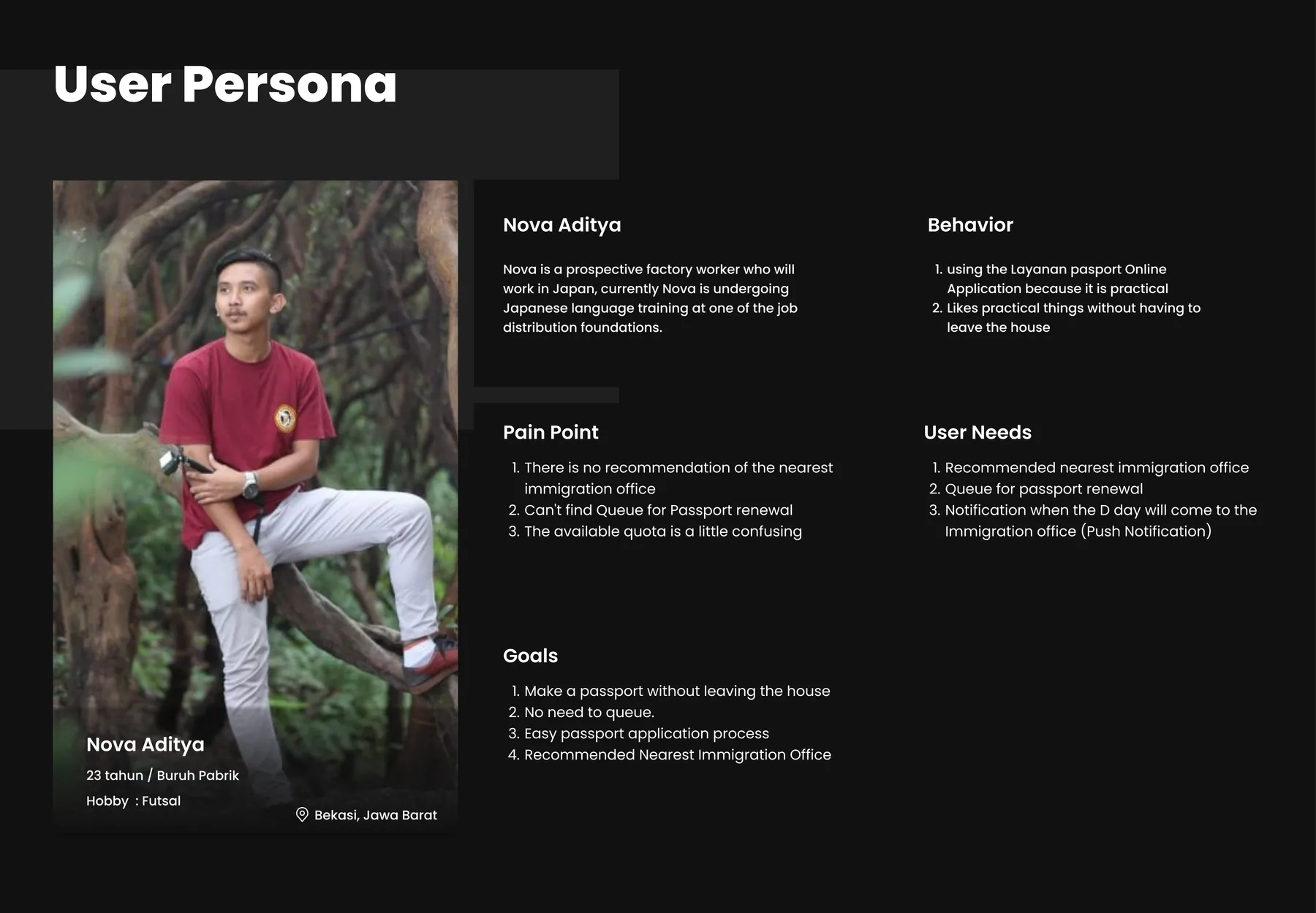
A persona describes a typical user: their demographics, behaviour, goals, pain points and frustrations. It helped me see the end-to-end experience from a wider angle.
Affinity mapping
After the usability tests and interviews, I listed every difficulty and concern each user mentioned, then grouped similar problems with affinity mapping. Green notes are comparisons between users, blue notes are the user's problems, and purple notes are what the user said.
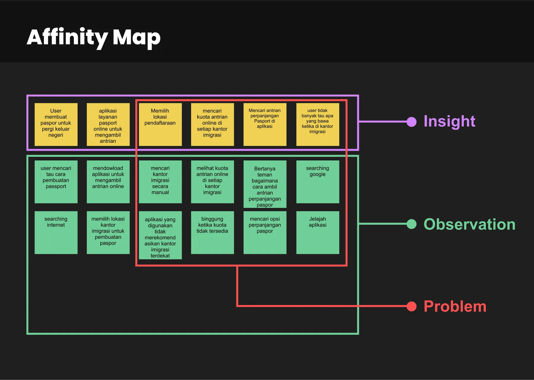
Pain points The affinity diagram above shows the difficulties participants ran into most often.
Pain points
- Users have to find the immigration office's location manually
- The app doesn't recommend the nearest immigration office
- Available and unavailable quota is confusing
- There's no passport renewal option
- Users don't know what to bring to the immigration office
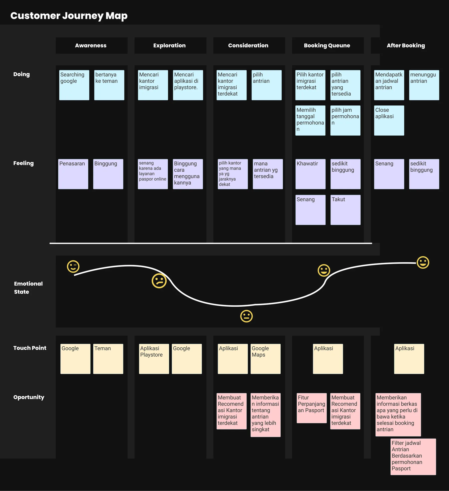
Customer journey map
A customer journey map visualises the steps users take to reach their goal.
It aims to:
- Show how users interact with the product or service today
- Show how they could interact with it in the future
Stage 3 — Ideate
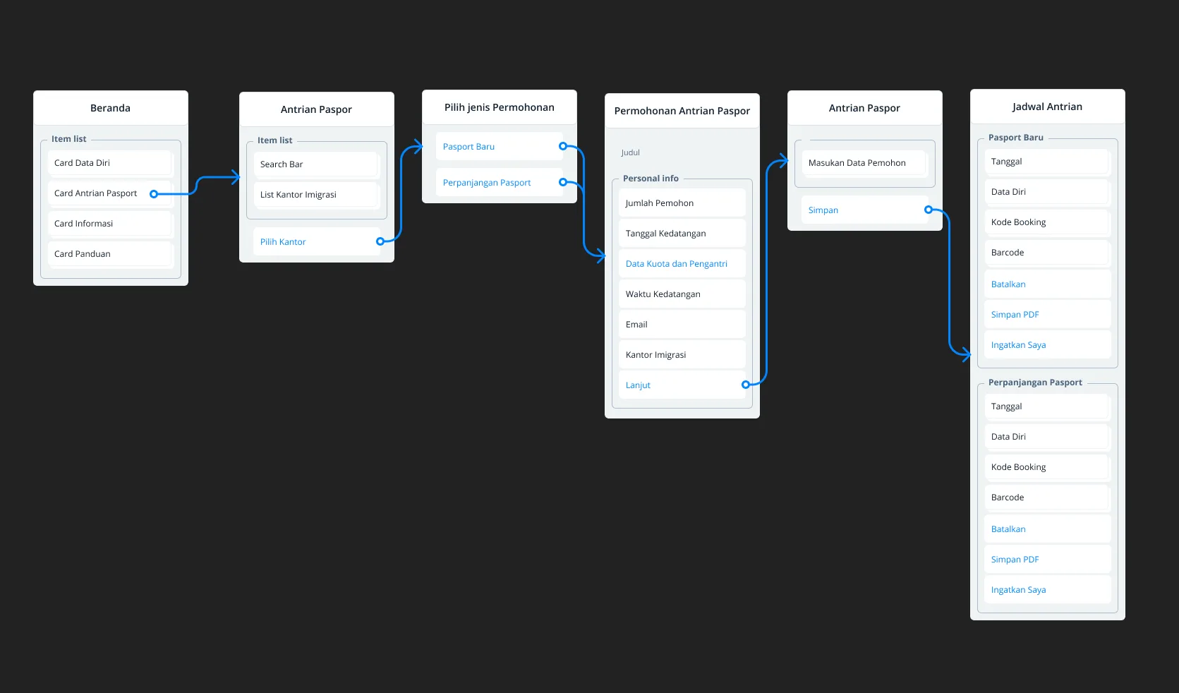
Information architecture
What is information architecture?
According to iainstitute.org, information architecture is the practice of deciding how to arrange the parts of something so that it's understandable. In other words, IA is about creating structures for websites, apps and other projects that help users understand where they are and find the information they want from there.
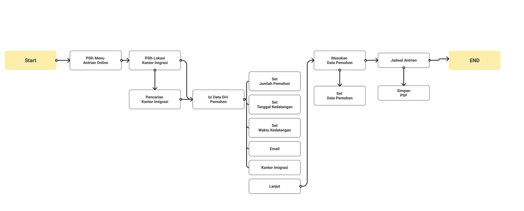
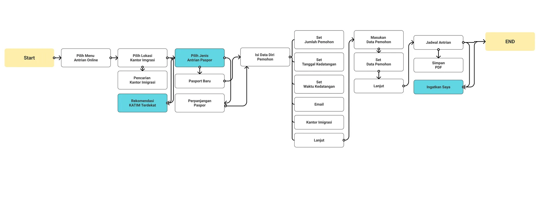
User flow
What is a user flow?
A user flow is the sequence of steps a user takes — here, to book a queue in the Layanan Paspor Online app.
User flow, before
User flow, after
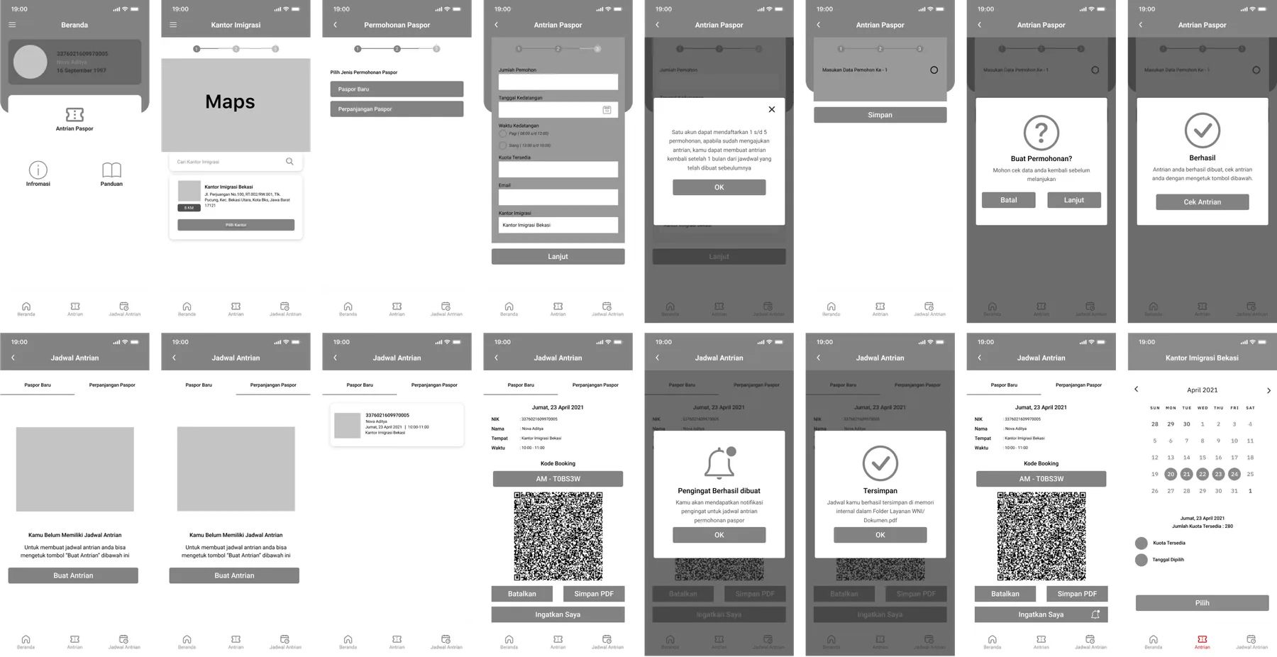
Low fidelity A wireframe lays out which interface elements will appear on the key pages. It's a critical part of the interaction design process.
Wireframes give a visual overview of the pages early in the project, so stakeholders and the team can agree on the direction before the visual design phase. They also help shape the main and secondary navigation, making sure the app's wording and structure match what users expect.
High fidelity
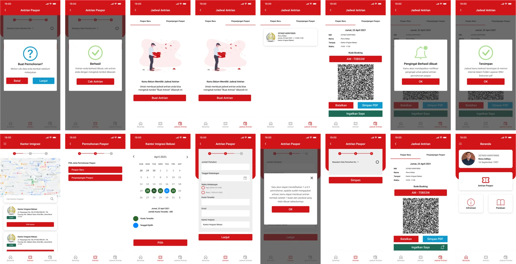
A high-fidelity design is precise: colours, sizes, spacing and the shape of every element are defined in detail.
The design
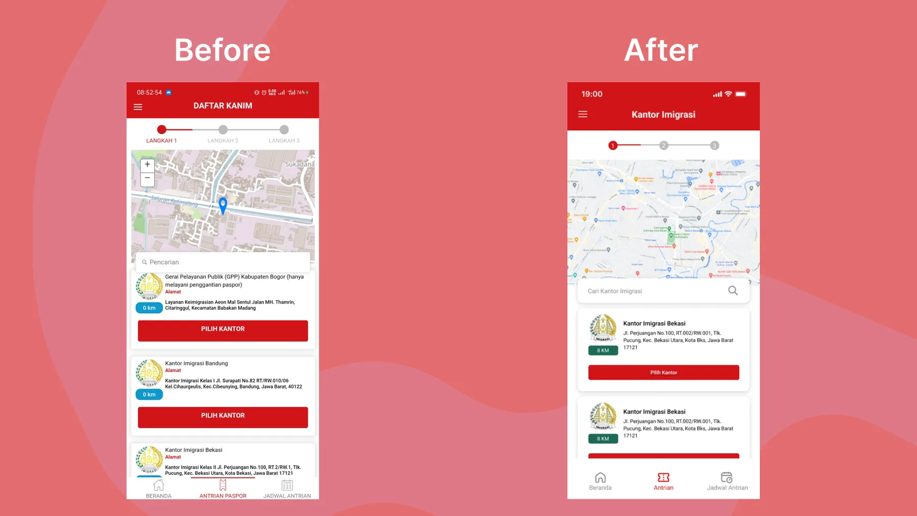
Immigration office list
I didn't change much on this page. My main recommendation is to sort the immigration offices by distance from the user's location.
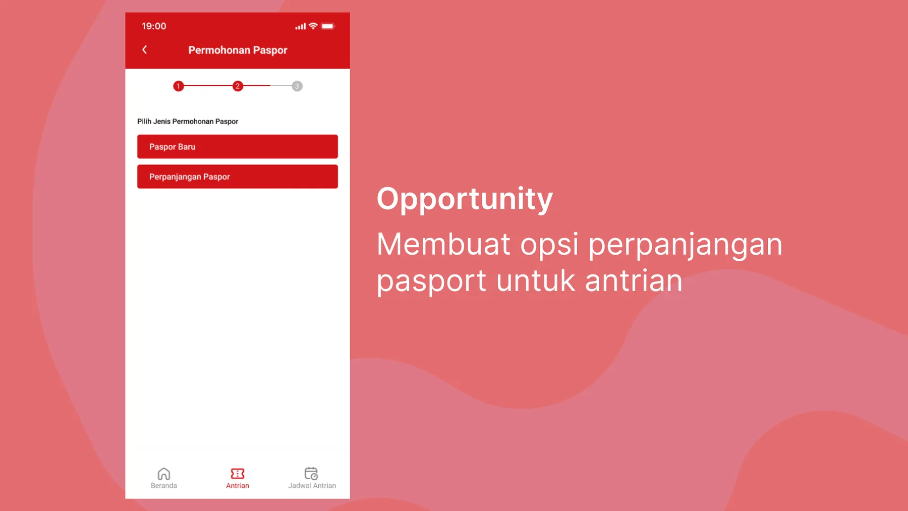
Passport application
Based on an opportunity from the customer journey map, I added a queue option for passport renewals.
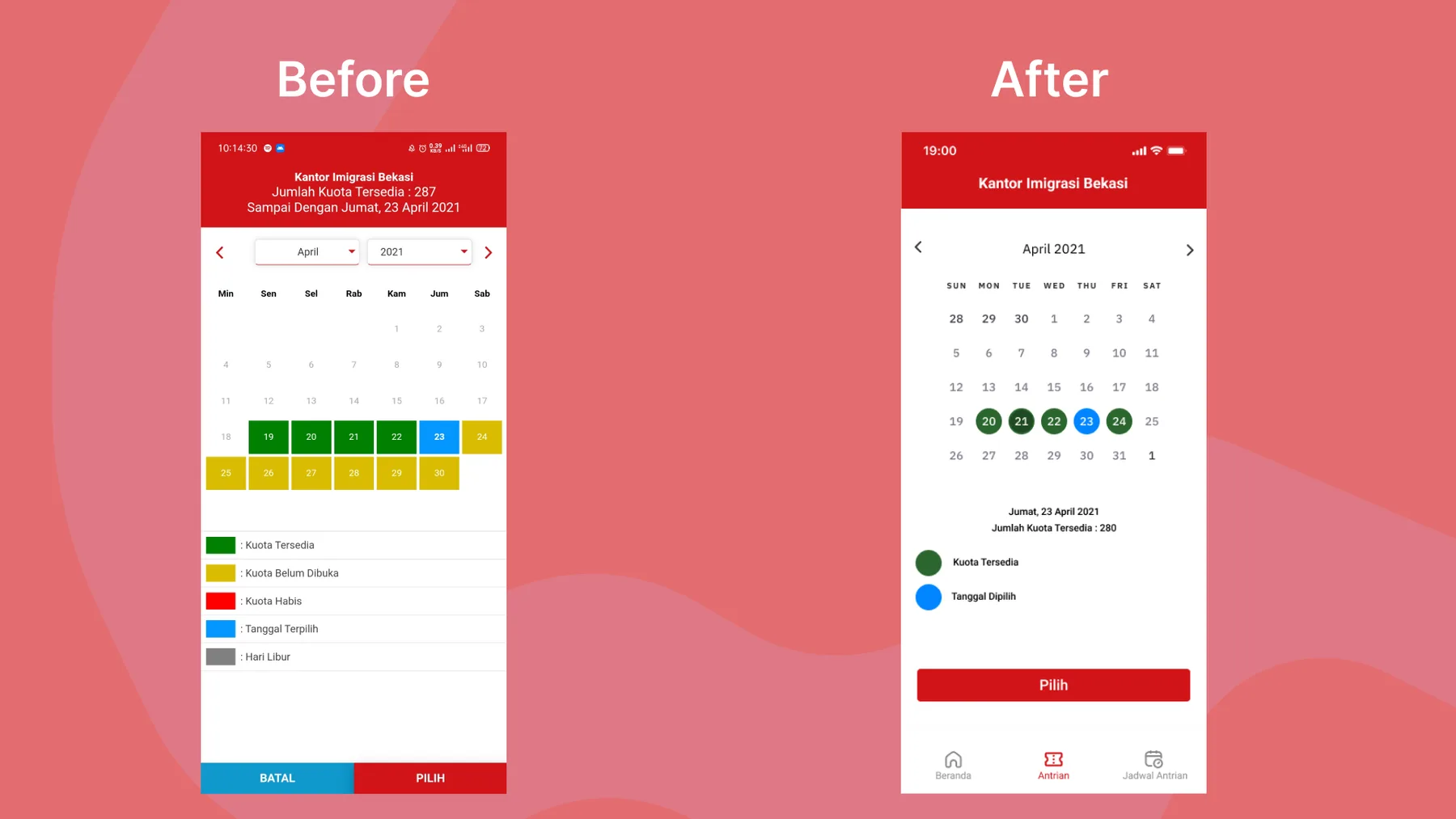
Choosing a queue date
The old queue availability information was too complicated, so I reduced it to two colours — "available quota" and "selected quota". When the user taps a date, the quota now appears below the date instead of above it, which makes it easier to find.
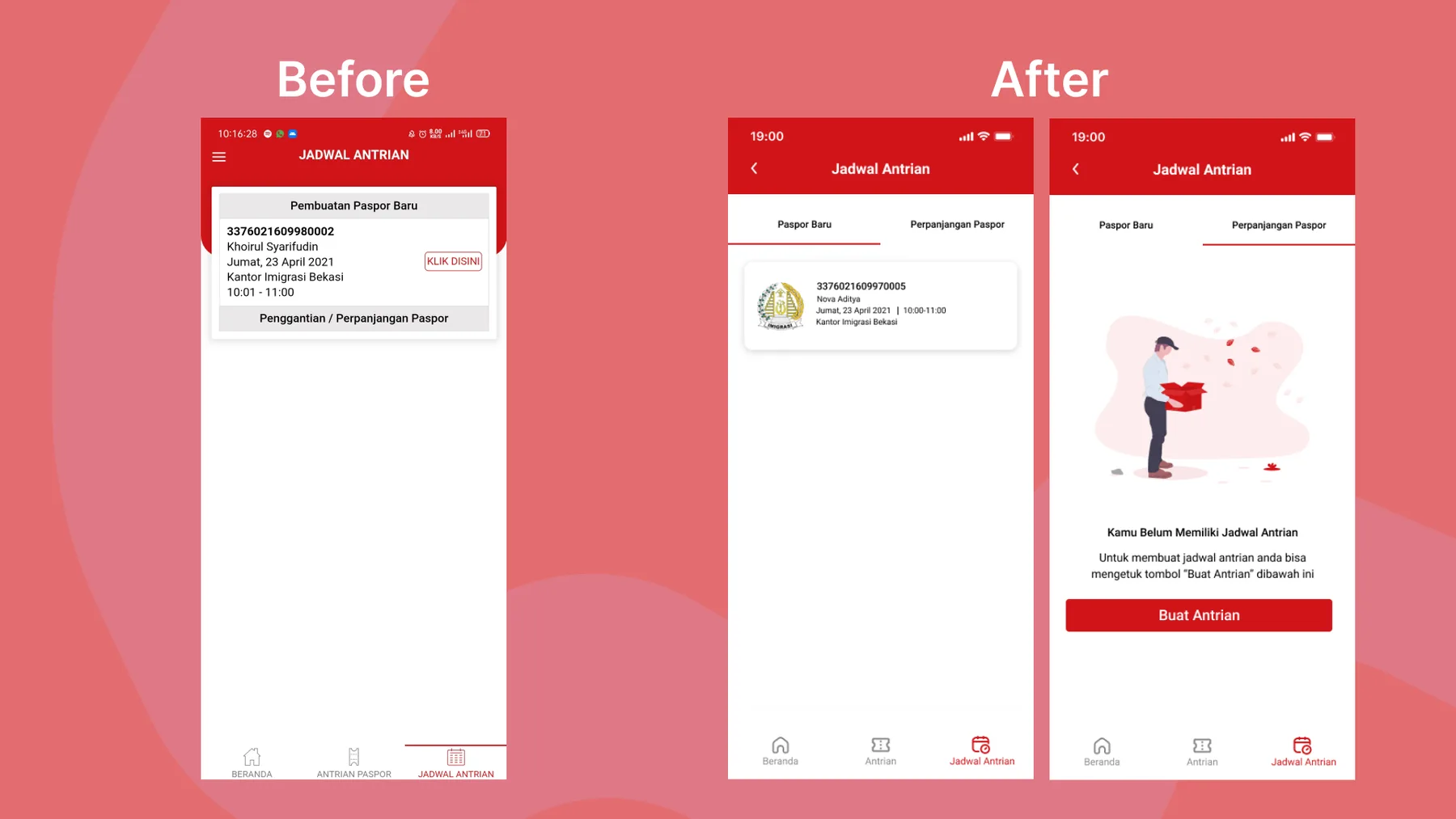
Queue schedule
In the previous design, tap targets were too close together and some elements weren't clickable at all. I proposed a simpler layout with clear slides and information.
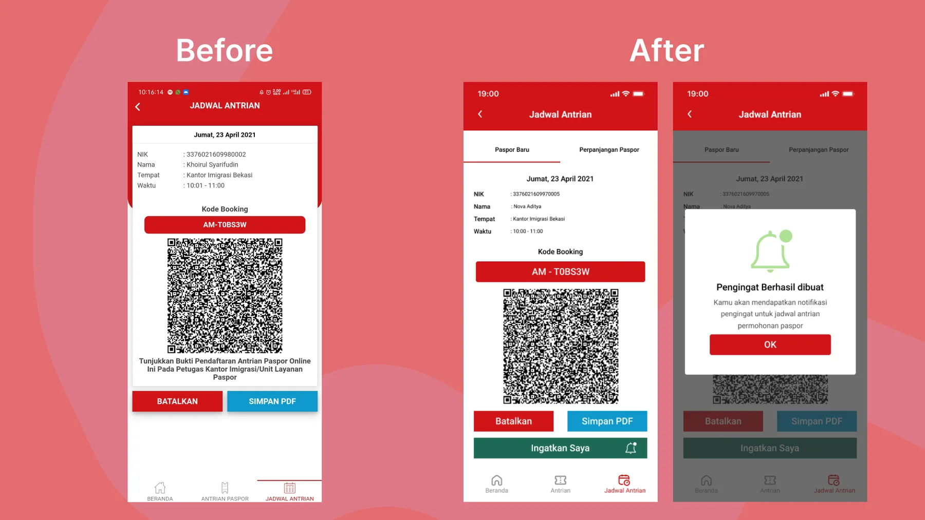
Queue details
Queue details were an opportunity to add a reminder for the visit to the immigration office, so users get notified and arrive on time.
Stage 4 — Prototype
What is a prototype?
A prototype is where an idea becomes a design you can try — for example, an app or website. It doesn't have to be digital; a prototype can also be physical.
Stage 5 — Test
Usability testing (UT)
Usability testing is a UX technique that evaluates how people use a product or service, using a range of methods. Its goal is to understand how users actually interact with it.
I ran in-person usability tests with the four respondents. No major issues came up: they liked the passport renewal option, the shorter and easier-to-read quota information, and the reminder that notifies them before their visit to the immigration office. One respondent did ask a question, though:
“When will this reminder show up? The day before? Or when?”
That question made me think, because the success message never said when the reminder would arrive.
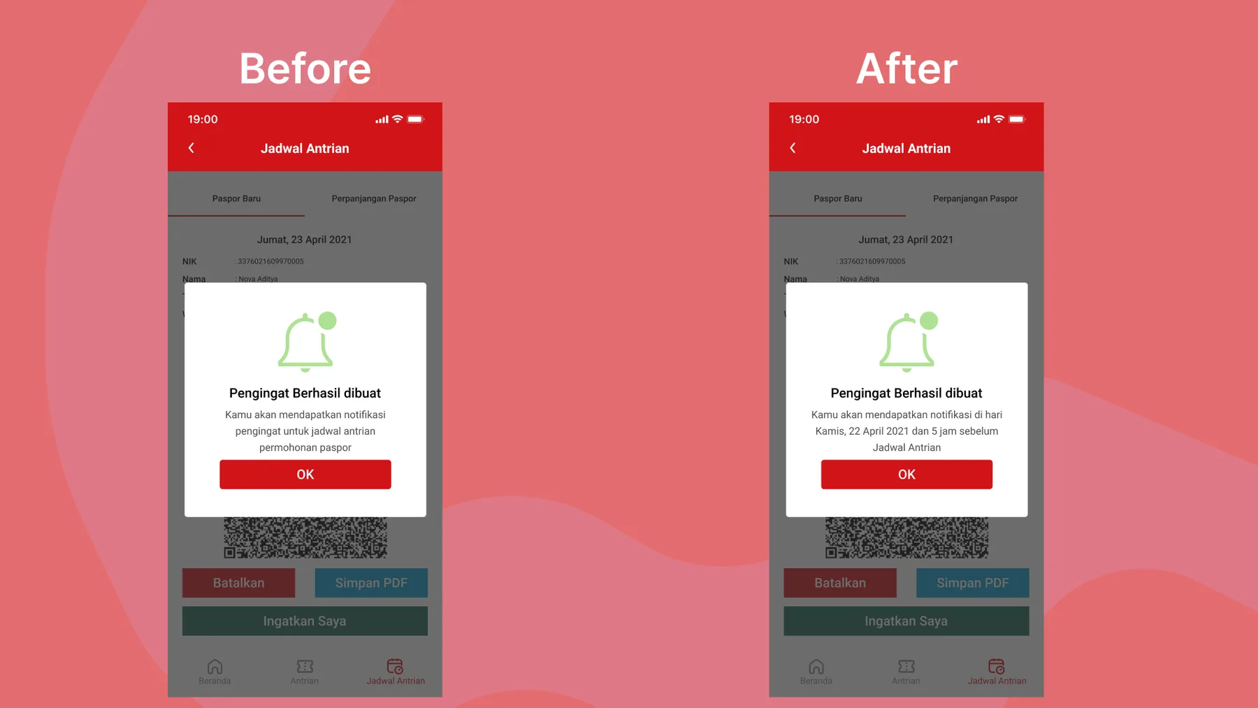
So I made the copy in the success dialog explicit: the reminder arrives one day before and again five hours before the queue time.
Closing
This final project took about two weeks, and it taught me a lot — especially how to interview people to get honest answers without biased questions. Thanks for reading — I hope the process above is useful to anyone working on a similar problem.
KhoirulAuthor
Thanks for reading — happy to walk you through the decisions on a call.